I’ve been continuing on down memory lane with Dungeon Keeper II, and have almost finished with the campaign. I just finished storming the Faerie Fortress.
Imps breaking down the back wall of the Faerie Fortress
It has been a lot of fun reliving the campaign. Soon now, I will get to the Dark Angel part in the campaign!
I’ve returned to my Google Location History Data (the previous installment of which is here), to implement something I had been thinking about for a while: setting a maximum time threshold for how far apart (temporally) two coordinate pairs (of the same activity type) can be and still be considered part of the “same trip.” Figuring out this threshold isn’t as obvious as I was originally thinking, but I still think I got something meaningful out of this exercise. I think a spread of 10 minutes obviously encompasses the same trip, but what about an hour? In many cases, likely not.
Recall that of ~1,000,000 data points (over 3 years), only 288,922 had any activities associated with them. This means, for the 1,000,000 data points, I have (on average) one point for every 31 seconds. For the 288,922 activity-associated data points, I have (on average) one point for every 109 seconds. So, the threshold will have to at least be 109 seconds, but most likely higher.
So I futzed around with the threshold a lot to see how that changed the results. I think 15-20 minutes is a pretty good threshold without allowing a ton of noise in, but the average miles/day for all the activities still seems pretty low with that threshold. The true number might lie somewhere closer between 20m and 1h. Or maybe I just don’t go as far as I imagine I do!
I wrote the threshold decider stuff in Ruby, because I had initially written the “sort-by-activities” script in Ruby (this was before I knew I was going to use Python for Basemap etc). And I had already written the Haversine script in Ruby, and I wanted to reuse that. Oh, well. Maybe one day I will normalize everything to be in Python, for consistency’s sake.
#Uses the Haversine formula to calculate the distance between two lat, long coordinate pairs
def haversine(old_lats_longs, new_lats_longs)
  lat1 = old_lats_longs[0]
  lon1 = old_lats_longs[1]
  lat2 = new_lats_longs[0]
  lon2 = new_lats_longs[1]

  r = 6371000
  phi1 = (lat1*Math::PI)/180
  phi2 = (lat2*Math::PI)/180

  deltaPhi = ((lat2-lat1)*Math::PI)/180

  deltaLambda = ((lon2-lon1)*Math::PI)/180

  a = Math.sin(deltaPhi/2) * Math.sin(deltaPhi/2) + Math.cos(phi1) * Math.cos(phi2) * Math.sin(deltaLambda/2) * Math.sin(deltaLambda/2)
  c = 2 * Math.atan2(Math.sqrt(a), Math.sqrt(1-a))

  distance = r * c

  return distance
end

#Decides whether to count a dated coordinate as part of the same trip or not, based on the time threshold
def threshold_decider(dated_coords) #dated_coords is an array of coordinate pairs with their time, format: [time,[lat,long]]
  threshold = 1000 #Set a maximum threshold (in seconds) for a coordinate to be counted in the same trip
  distance = 0
  total_time = 0
  time_period = dated_coords.first[0]-dated_coords.last[0]

  previous_time = dated_coords.first[0]
  previous_lats_longs = dated_coords.first[1]

  dated_coords.each do |dated_coord|
    (distance+=haversine(previous_lats_longs, dated_coord[1])) && (total_time+=(previous_time-dated_coord[0])) if previous_time-dated_coord[0] <= threshold
    previous_time = dated_coord[0]
    previous_lats_longs = dated_coord[1]
  end
end
This is the meat of the threshold decider. Pretty simple. Almost exactly identical to the old Haversine distance calculator I wrote to get me aggregate distances, except the distances only get calculated/added if they are within the temporal threshold.
This is pretty much the context I have it in right now, with the file-reader and human-friendly-displayer (et al) to quickly display some of the stats that I am interested in seeing:
require 'time'

#Uses the Haversine formula to calculate the distance between two lat, long coordinate pairs
def haversine(old_lats_longs, new_lats_longs)
  lat1 = old_lats_longs[0]
  lon1 = old_lats_longs[1]
  lat2 = new_lats_longs[0]
  lon2 = new_lats_longs[1]

  r = 6371000
  phi1 = (lat1*Math::PI)/180
  phi2 = (lat2*Math::PI)/180

  deltaPhi = ((lat2-lat1)*Math::PI)/180

  deltaLambda = ((lon2-lon1)*Math::PI)/180

  a = Math.sin(deltaPhi/2) * Math.sin(deltaPhi/2) + Math.cos(phi1) * Math.cos(phi2) * Math.sin(deltaLambda/2) * Math.sin(deltaLambda/2)
  c = 2 * Math.atan2(Math.sqrt(a), Math.sqrt(1-a))

  distance = r * c

  return distance
end

#Decides whether to count a dated coordinate as part of the same trip or not, based on the time threshold
def threshold_decider(dated_coords) #dated_coords is an array of coordinate pairs with their time, format: [time,[lat,long]]
  threshold = 1000 #Set a maximum threshold (in seconds) for a coordinate to be counted in the same trip
  distance = 0
  total_time = 0
  time_period = dated_coords.first[0]-dated_coords.last[0]

  previous_time = dated_coords.first[0]
  previous_lats_longs = dated_coords.first[1]

  dated_coords.each do |dated_coord|
    (distance+=haversine(previous_lats_longs, dated_coord[1])) && (total_time+=(previous_time-dated_coord[0])) if previous_time-dated_coord[0] <= threshold
    previous_time = dated_coord[0]
    previous_lats_longs = dated_coord[1]
  end

  display(time_period, total_time, distance)
end

#Reads the file of sorted Google Location History data
def reader()
  dated_coords = [] #An array of coordinate pairs with their timestamp, format: [timestamp,[lat,long]]

  File.open("inVehicle.txt", 'r') do |file|
    file.each_line do |line|
      columns = line.split("\t")
      dated_coords << [Time.parse(columns[0]),[columns[1].to_f,columns[2].to_f]]
    end
  end

  threshold_decider(dated_coords)
end

def sec_to_year(seconds)
  seconds/31536000
end

def sec_to_hour(seconds)
  seconds/3600
end

def sec_to_day(seconds)
  seconds/86400
end

def m_to_km(meters)
  meters/1000
end

def m_to_mi(meters)
  meters/1609
end

#Displays all the information in a way that humans like to read
def display(time_period, total_time, distance)
  puts "The time period was #{sec_to_year(time_period).round(2)} years!"
  puts "The total distance gone over that full time period was #{m_to_km(distance).round} kilometers, or #{m_to_mi(distance).round} miles!"
  puts "You spent #{sec_to_hour(total_time).round} hours doing it!"
  puts "That is an average of #{(m_to_mi(distance)/sec_to_day(time_period)).round(2)} miles per day!"
  puts "You've spent #{((total_time/time_period)*100).round(2)}% of your time doing this activity!"
  puts "You've averaged #{(m_to_mi(distance)/sec_to_hour(total_time)).round}mph!"
end

reader()
So! Let us see some of my results I got with the threshold set to 1,000 seconds.
Walking:
The time period was 2.8 years!
The total distance gone over that full time period was 5543 kilometers, or 3445 miles!
You spent 1864 hours doing it!
That is an average of 3.37 miles per day!
You’ve spent 7.6% of your time doing this activity!
You’ve averaged 2mph!
Bicycling:
The time period was 2.79 years!
The total distance gone over that full time period was 3047 kilometers, or 1894 miles!
You spent 297 hours doing it!
That is an average of 1.86 miles per day!
You’ve spent 1.22% of your time doing this activity!
You’ve averaged 6mph!
In a Vehicle:
The time period was 2.8 years!
The total distance gone over that full time period was 31394 kilometers, or 19511 miles!
You spent 1299 hours doing it!
That is an average of 19.12 miles per day!
You’ve spent 5.3% of your time doing this activity!
You’ve averaged 15mph!
All sounds pretty reasonable to me! Except maybe the speeds for all three seem pretty low. Likely because I am already including lots of time periods of me not moving. But the distances/day seem like roughly what I would expect to see. Anyhow, not much I can do with this now except futz with the threshold and see what seems most reasonable.
I’ve recently been playing around with the Google Maps Javascript API in my Rails web apps to make some simple maps. Google’s documentation on this is very very good, so in most cases I’d recommend you start there to figure out how to make the map you want. Nonetheless, I thought I’d write up a quick tutorial for making a very simple map, making/displaying markers, and automatically re-positioning the map based on multiple location markers (from the perspective of using it in a Rails app).
  <div id="map"></div>
 <script>
 var map;
 function initMap() {
 map = new google.maps.Map(document.getElementById('map'), {
 center: {lat: -34.397, lng: 150.644},
 zoom: 8
 });
 }
 </script>
 <script src="https://maps.googleapis.com/maps/api/js?key=YOUR_API_KEY&callback=initMap"
 async defer></script>
Remember to set the styling for #map to be whatever size you want the div to be in your stylesheet, because this is what will determine the size of your map.
The first obvious place to make this map dynamic is the lat, lng. Presumably you will have a variable declared in the controller that has a latitude and longitude associated with it, or perhaps you even have latitude and longitude variables available. In my case, I have @contact defined in the show action of my contacts controller as an instance of the contact class. Each contact instance has a latitude and longitude associated with it, based on the address input by the user (using Geocoder to look them up); from the create action:
city = Geocoder.search(params[:address])
contact.latitude = city[0].latitude
contact.longitude = city[0].longitude
So on the show view, the latitude and longitude would be accessible via @contact.latitude and @contact.longitude (respectively). And be sure to define your Google API key in the environmental variable hash, so you don’t go pushing that key up anywhere you wouldn’t want it to go. Actually, better go do that first.
Now you can put in your environmental variable for your API key, as well as embedded Ruby for your latitude and longitude:
<script>
      var map;
      function initMap() {
        var myLatLng = {lat: <%= @contact.latitude %>, lng: <%= @contact.longitude %>};

        map = new google.maps.Map(document.getElementById('map'), {
          center: myLatLng,
          zoom: 12
        });
      }
    </script>
    <script src="https://maps.googleapis.com/maps/api/js?key=<%= ENV["google_key"] %>&callback=initMap"
    async defer></script>
That will make a simple map centered on your latitude and longitude. But obviously, what we all really want is a marker. So, let us put in a marker!
<script>
  var map;
  function initMap() {
    var myLatLng = {lat: <%= @contact.latitude %>, lng: <%= @contact.longitude %>};

    map = new google.maps.Map(document.getElementById('map'), {
      center: myLatLng,
      zoom: 12
    });

    // makes a marker
    var marker = new google.maps.Marker({
      position: myLatLng, //at your latitude and longitude
      map: map, //on the map called map
    });
  }
</script>
<script src="https://maps.googleapis.com/maps/api/js?key=<%= ENV["google_key"] %>&callback=initMap"
async defer></script>
Feel free to play around with the zoom until you get it to where you like it. I find that 12 is pretty good for a single marker, but your tastes/needs may vary. The higher the number, the higher the zoom. So zoom: 1 will basically give you a map of the whole world. Which, maybe you want!
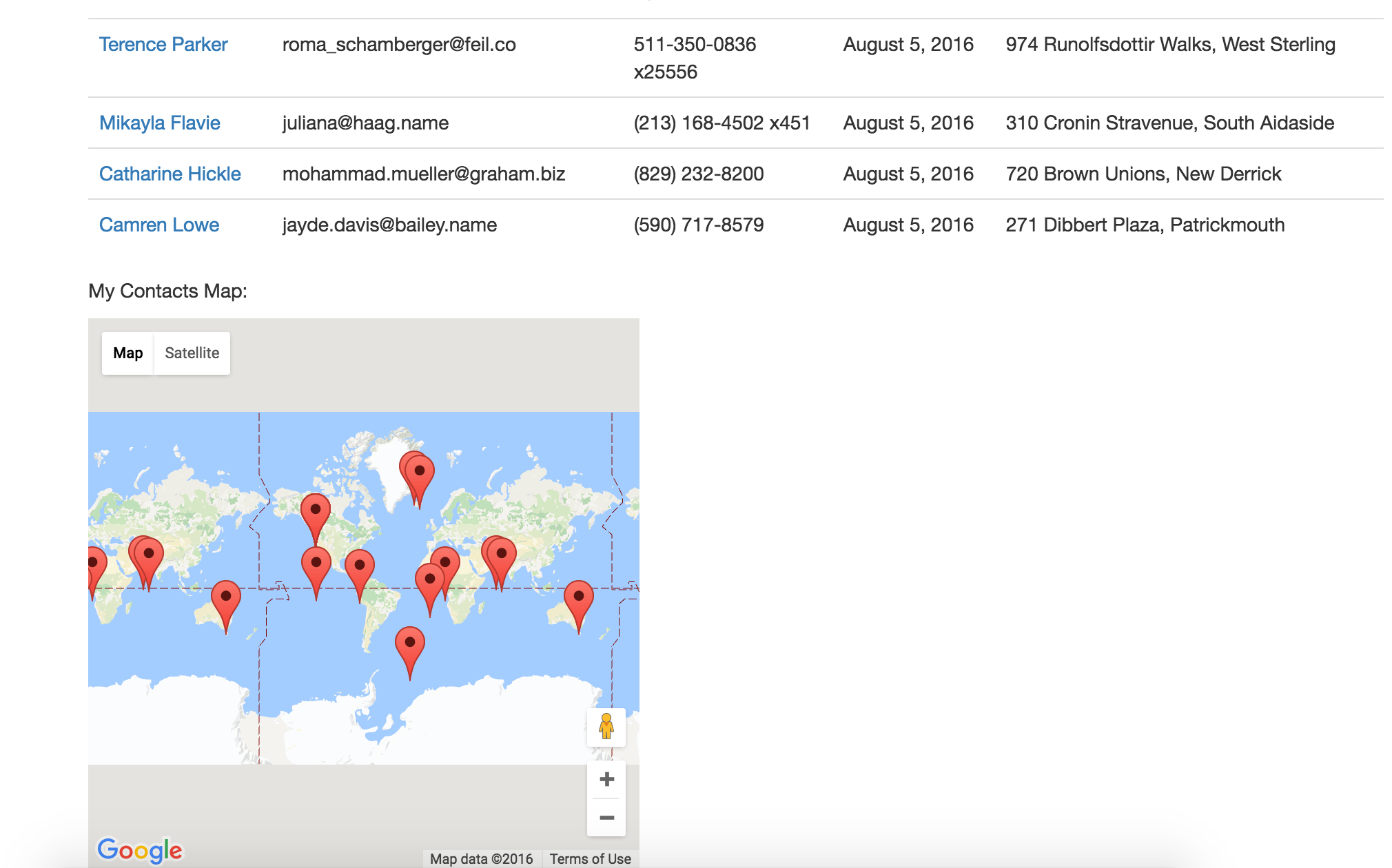
But now, what if you have a bunch of markers, and you want to adjust the center/zoom based on them? Obviously you wouldn’t be able to just use one marker’s latitude and longitude to determine the center anymore. Well, there is a simple way to do this, too! All you need to do is define a LatLngBounds variable, and then use the extend and fitBounds methods. For this example, I put the map in the contacts index, so there would be multiple lat, long coordinates to play with:
<script>
   var map;
   function initMap() {
     var contacts = <%= raw @script_contacts %>;

     var bounds = new google.maps.LatLngBounds(); //these will define the bounds of your map
     map = new google.maps.Map(document.getElementById('map'), {}); //this makes your map caled map

     for (var i = 0; i < contacts.length; i++) { //Iterate over all the contacts
       var contact = JSON.parse(contacts[i]);
       var marker = new google.maps.Marker({ //Make a marker for each contact as you iterate
         position: {lat: contact.latitude, lng: contact.longitude},
         map: map,
       });
       bounds.extend(marker.position); //will extend your bounds each time a contact is added
     }

     //refit the map to the bounds as defined in your each loop
     map.fitBounds(bounds);
    }
 </script>
Et voila! It really is that easy. And now you have a map that will re-center/re-zoom to fit/show all the markers on it. If you want to force the zoom to a certain level, and only let the centering change, all you have to do is define the zoom anywhere after you use the fitBounds method on your map. I don’t really like forcing the zoom, though, I find I like it best when the map finds it own zoom.
Oh, yea, and this is what happens when you use the Faker gem to randomly generate a bunch of latitudes and longitudes for a bunch of randomly generated contacts… you get contacts in the middle of the ocean, lol:
You’d be surprised at how many people live in the middle of the ocean these days
But I got sick of manually entering actual addresses, so now I have ocean contacts. This is the generally-accepted tradeoff.