
So I’ve been doing some more investigating of my Google Timeline Data here and there (as I started writing about here).
After my last post, a friend of mine pointed me towards the Haversine formula for calculating distance between two sets of lat, long coordinates and with that I was able to calculate distances on a day-by-day basis that were consistently close to Google’s estimations for the days. Encouraged, I then moved on to calculating distances on a per-year basis, and that was fun. I got what seemed reasonable to me:
Between 5/22/15 and 5/22/16 I went 20,505 miles
Between 9/20/2013 and 5/22/16 I went 43,434 miles
Recall that these are for every sort of movement, including airplanes. So you can see my average miles/day went way up recently, due to a few big recent airplane trips. So if the numbers seem high (~60 miles a day, ~45 miles a day), this is why.
But then I wanted to visualize some of the data. I decided to use matplotlib to plot the points because it is easy to use and because Python has an easy way to load JSON data.
So I ended up breaking down the points by the assigned “activity.” True to my word, I only considered the “highest likelihood activities,” and discarded all the other less likely ones. To keep it simple.
You may recall that I had a total of 1,048,575 position data points. Well, only 288,922 had activities assigned to them. So just over a quarter. Still, it is enough data to have a bit of fun with.
Of those 288,922 data points with activity, it turns out that there were only a total of 7 different activities:
still
unknown
onBicycle
onFoot
tilting
inVehicle
exitingVehicle
The first obvious thing to do was to sort by activity type and then plot the coordinates segregated by activity type.
import numpy as np
import matplotlib.pyplot as plt
from mpl_toolkits.basemap import Basemap
import csv

latitudeArray = []
longitudeArray = []

with open("bicycle.csv") as csvfile:
    reader = csv.reader(csvfile)
    for row in reader:
        x, y = float(row[0]), float(row[1])
        latitudeArray.append(x) #storing all the latitudes and longitudes in separate arrays, but the index is the same for each pair
        longitudeArray.append(y)

m = Basemap(llcrnrlon=min(longitudeArray)-10, #Set map's displayed max/min based on your set's max/min
    llcrnrlat=min(latitudeArray)-10,
    urcrnrlon=max(longitudeArray)+10,
    urcrnrlat=max(latitudeArray)+10,
    lat_ts=20, #"latitude of true scale" lat_ts=0 is stereographic projection
    resolution='h', #resolution can be set to 'c','l','i','h', or 'f' - for crude, low, intermediate, high, or full
    projection='merc',
    lon_0=longitudeArray[0],
    lat_0=latitudeArray[0])

x1, y1 = m(longitudeArray, latitudeArray) #map the lat, long arrays to x, y coordinate pairs

m.drawmapboundary(fill_color="white")
m.drawcoastlines()
m.drawcountries()

m.scatter(x1, y1, s=25, c='r', marker="o") #Plot your markers and pick their size, color, and shape

plt.title("Steen's Bicycling Coordinates")

plt.show()
Note that, at the time, I wrote a script which saved all the different activity types into their own CSV, because I wanted to look at them and play with them individually. And I then decided to load these CSV files into my script for plotting – because they were there. Note that, if I went back and did it again, I’d probably not bother with the CSV intermediary, and just go straight from the geoJSON file.
And in this way I was able to see the different activities plotted onto Basemap’s default map thing:
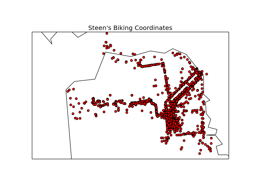
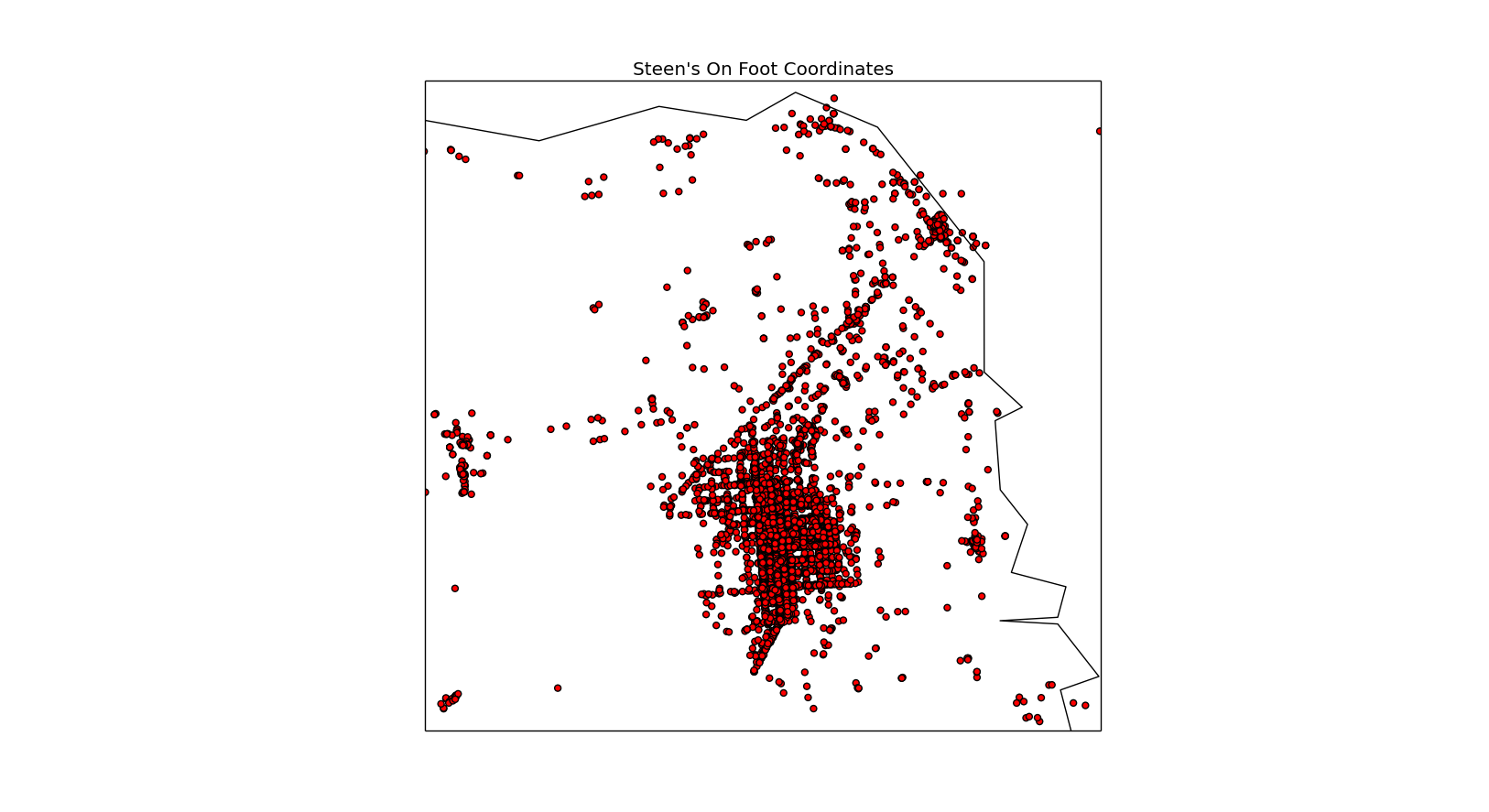
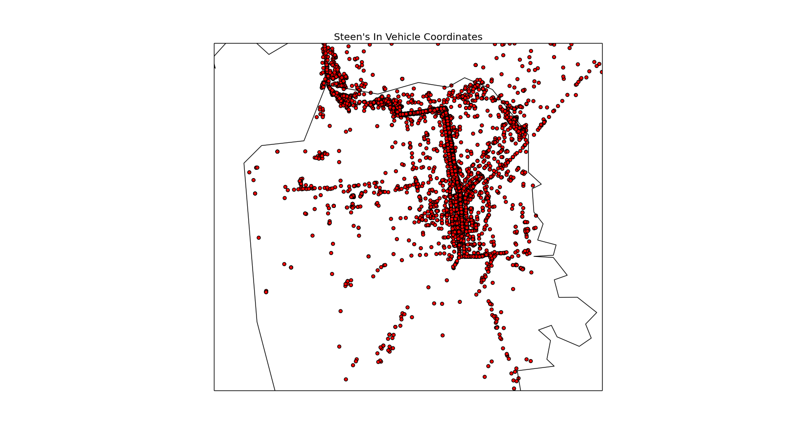
I also plotted the other categories – including the mysterious “tilting,” but I couldn’t really discern any sort of meaning from those. They just looked like all the points from everywhere I’ve ever been, and were therefore not very meaningful. Not like the dramatic differences between the points and obvious routes for biking, on any sort of vehicle, or walking. So, there’s no need for you to see those.
I’d say this was a success. So my next question is to figure out how much time I spend doing each activity. And how much time I spend in each place. I’ll have to think about it a bit on how to calculate the time. All those points with no activity associated with them have me concerned that it won’t be very straightforward to just subtract the timestamps to get ΔT. It could be the case that in the “no activity” points, I had ended up doing completely different things, and then returned to the original activity (in which case the calculated ΔT would be incorrect). But, then again, it is probably very likely that all those “no activity” points actually are the same activity if they are bookended by it. Hmm.
So now I’m wondering if, given that a time point is uploaded every 60 seconds, I should just say 1 timepoint = 60 seconds? That doesn’t seem quite right to me, but I’ll work it out for a smaller data set and see if that even comes close to accurate. I’ll keep thinking about it, but if anybody has any suggestions on how to get around this problem, feel free to let me know!
I want to do the same thing you have done with your time and maps. Is there an easy format to drop the information into
Unfortunately my stuff was mostly just me messing around so it is kind of messy and not very refactored, but these follow-ups might be helpful because I did include a bit of the code I used in them:
http://www.certainly-strange.com/?p=989
http://www.certainly-strange.com/?p=1077
This post from Beneath Data I used extensively in my later experimentation has it all laid out very nicely and you will probably also find it helpful: http://beneathdata.com/how-to/visualizing-my-location-history/
And the Haversine Formula itself, which I ended up using to calculate distances between coordinates because it seemed good enough, might also be handy if that’s what you want to do:
https://en.wikipedia.org/wiki/Haversine_formula